In my previous post I wrote about the reading slump I experienced this summer and how I got out of it by suddenly remembering that I once spent 4+ years studying English Literature and thinking that I would very much like to revisit reading classic works from the 18th and 19th centuries.
As my excitement for exploring and reading the classics grew, so did my list of books to read. And in thinking of which books I’d like to begin with, and envisioning the collection of classics that I would eventually possess and where I would house them and what they would look like, the biggest question on my mind then became, “What editions of classics do I start buying/collecting?” They have to match, after all!
In search of an answer, I found some Youtube videos that compare the different editions by the most popular publishers of classics, and went on Reddit to see what other readers had to say. I also visited my neighbourhood bookstore to see what editions they might have that I could hold and feel and judge how I might like for myself. I like a floppy book (not a fan of breaking book spines), and one whose copy doesn’t strain the eye. Some decent margins and a comfortable layout are also important.
I eventually concluded to fill my shelves with the black spine editions of Penguin Classics. They usually have very good introductions and explanatory notes, and their catalogue is by far the largest, I think. They also have great English translations for translated works. They’re more consistent, generally, in the size and clarity of fonts they use, and offer good margins for notation. There are exceptions (I’ve found that their books printed in the United States are sometimes poorer in font quality, as are some of their classics that deal with old/historical texts), but overall, they are few.
However—
I then learned that in 2019 Penguin redesigned their classics series and started gradually re-printing their catalogue with new covers.
Let me state here that I thoroughly dislike their new look. They are much lacking in character, and while I understand that they offer a more legible design, they look much too modern and sterile for a collection that has “Classics” in its name.
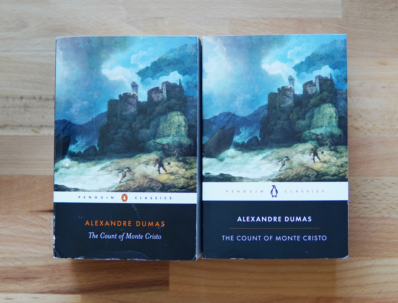
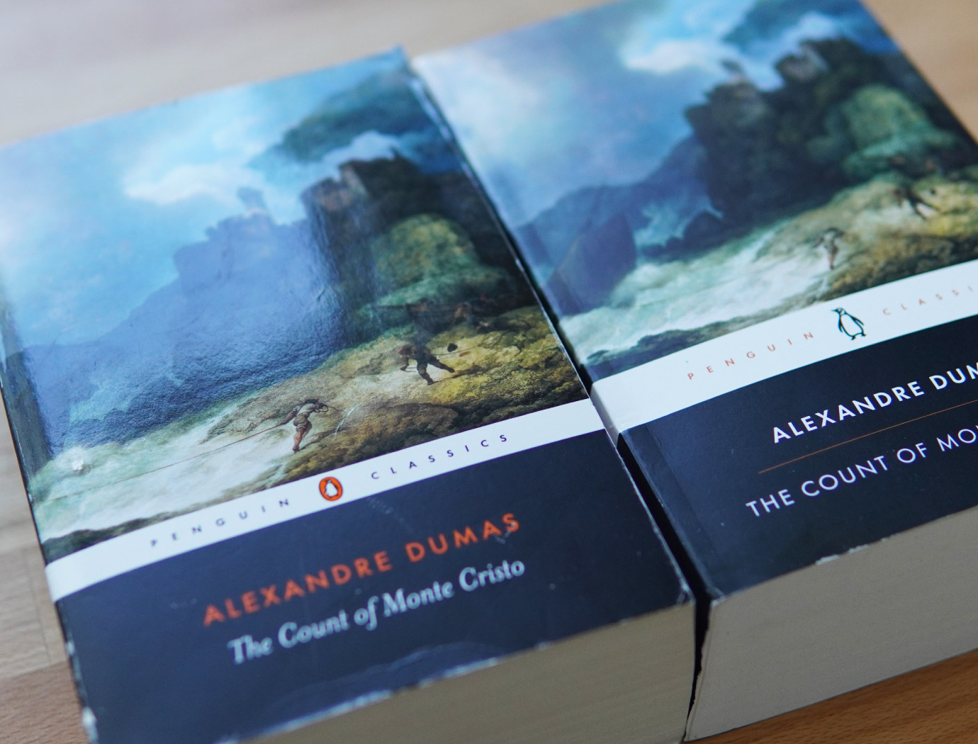
But even if I were to set aside my dislike of the new look, the other drawback is that when the books are lined up on one’s bookshelf, if one were to have a mix of both editions, and if one were to, say, organize one’s books alphabetically, key elements in the new design don’t match up with those of the old, neither in style nor in placement…the visual consistency would be broken.
Seeing two books next to each other (as pictured below) isn’t so bad, but if you had shelves full of these Penguin books, as I planned on having, the invisible yet perceptible line of zig zag created by the different banner sizes that would run across one’s shelves, with other stylistic differences sprinkled in between, would be a visual mess. In the grand scheme of things, it’s not a big deal, but it’s enough to put me in a state of unease.

Okay, fine, I can organize my books in two sections so that the two styles of books don’t mingle. I can live with that.
However, upon actually holding one of their new books in my hands, it became clear that the print quality of these new versions is inferior to the previous editions printed 20 years ago. They got rid of the finer finishes on their previous covers (gloss application on the cover image and logo), and the binding is tighter, adding more stiffness to the spine and making for a more rigid book-holding and reading experience—understandable for 800+ page books, which naturally may be more rigid, but not for shorter books. The paper is thinner and of slightly decreased quality, and the copy ink seems to sit on the surface of the pages rather than settle into their fibres. I often underline parts in pencil or write short comments in the margins, and with these new editions, the ink lifts easily if I attempt to erase these markings and inadvertently, and often unavoidably, rub over the words as well. One might say I’m being fussy, but if you’re familiar with the Penguin Classics of old, there’s no mistaking the shift in quality.
Overall, there is enough for me to dislike about these new versions of Penguin Classics that I very much prefer the older editions…which means that I now have to pretty much shop for them secondhand.
This isn’t a problem, of course, but it is a challenge, as it means having to continually visit secondhand bookstores where it is left to chance as to whether or not I’ll find what I’m looking for. Thrift stores are also an option, but the non-profit ones (Salvation Army, Goodwill, etc.) are few around my area and mainly found in the suburbs, and we recently found out that the for-profit thrift store whose many locations we used to frequent has ties to the occupying apartheid illegal “state” that shall not be named and have therefore boycotted it.
Now, you might ask, “Fin, how about buying the secondhand books online?” Well, that’s where Penguin makes things even more infuriating. Several times did I order a book from eBay or an online secondhand bookstore from listings that show the book’s image with its old cover, only to open the envelope when the book arrives in the mail and find that I’ve been sent a copy with the updated cover. After experiencing this frustration one too many times, I looked into it and learned that Penguin doesn’t change the ISBN numbers of their books when they re-print them with the updated covers—the same ISBN number is used for a particular title whether it is still available to purchase with the old cover design or has been re-printed since 2019 with the new one. Naturally, I then resolved that if I do order from eBay in the future, I shall only do so from small sellers who have photos of the actual physical book on their listing rather than a stock image.
Furthermore, Penguin’s own website, on which you can search their entire catalogue, doesn’t always have the updated cover image of their books. Even my local bookstore can’t know what version of a book they’ll get directly from Penguin if I place an order through them because their system pulls a stock cover image from another central database that may not be updated. So basically, unless I know for sure that a book has been re-printed with the new design (and can therefore avoid it), if I order a book online that is pictured with the old cover design, it’s a gamble.
Urgh!!
*Sigh*
Sometimes I do get fed up with the search for them and will “settle” for a different edition if a sudden urge comes over me to want a certain book and I can’t find it in the black spine version. For example, I also like the Penguin English Library classics, mainly because they are very comfortable to hold and are formatted nicely, but the downside is that they have no explanatory notes, which I really value having. Luckily, I have devised a workaround for this and will expand on it in my next post. I also quite like Oxford’s World Classics, as they too have a wide range in their catalogue and provide excellent notes, and the books feel good to hold, but unfortunately, they’re a bit less consistent when it comes to their fonts and text clarity (chunky or crowded copy), so I only buy them when I can’t find a Penguin equivalent or if their translations of non-English works are better/more to my liking.
All that is to say that I do love the (older) Penguins, and am certain to always prefer them over other editions if given the choice, and I am determined to search high and low for them until I have collected, either new or secondhand, the ones I desire to read.